I just read an interesting article in the Chronicle of Philanthropy about different fonts and how they can make a BIG difference when it comes to how your reader engages with your material. Are you using fonts that draw your readers in or drive them away?
If you’ve worked hard on your writing, it probably has gone through several rounds of painstaking writing and editing (well, at least two). The process may have even involved some late nights and unhealthy doses of caffeine. I am quite certain that you would agree: Such a fine specimen deserves a great visual presentation!
Ask yourself: When was the last time someone said, “Yes, I can see what you’re saying”?
People need to be able to picture your message, both figuratively and literally. Our culture is extremely visual; it behooves you as a writer to not only notice this, but to also let that knowledge help you find more readers.
A clean, consistent, and provocative design is an essential ingredient of any well-produced message. Visual appeal grabs your readers’ attention and keeps them
around long enough for your words to inform, inspire, and activate. Without the right look, your carefully crafted piece can end up like an overlooked flower
lost in a field of weeds. If a reader happens to stumble upon your beautiful words, a poor design could mark it as not worth the hassle to untangle. Your forget-me-not
becomes a “remember-me-not.”
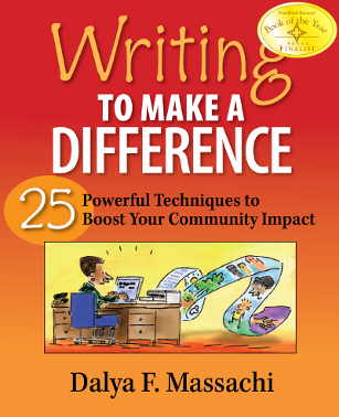
Solid graphic design techniques make readers take words more seriously. Why not enhance your strategy of “writing to make a difference”?
A good place to start is the font(s) you’re using. Check out this article and feel free to leave comments!


